No. 68, June 2017
|
|
|
No. 68, June 2017 |
|
|
No. 68 (June 2017) Neo-imperialism and Labor Compression Widening the Gulf: II. Growth that Reproduces Backwardness III. How One Class Enriches Itself at the Expense of Another
|
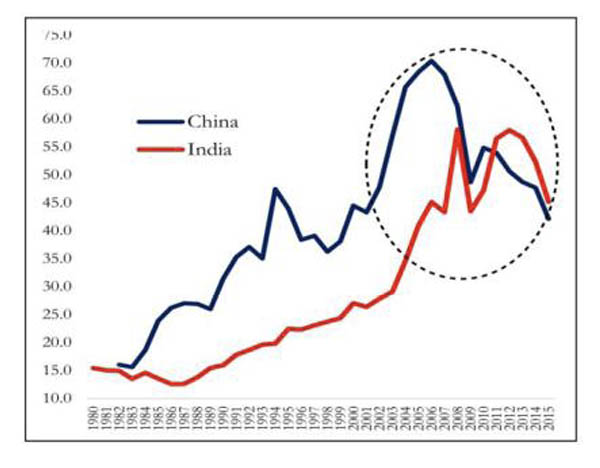
Widening the Gulf II. Growth that Reproduces Backwardness Coupling and decoupling, twin processes First, let us take what the Survey considers to be good news. The Survey celebrates the fact that “India has replaced its erstwhile socialist vision with something resembling the ‘Washington Consensus’: open trade, open capital, and reliance on the private sector.... Reforms along these lines have been adopted by every Indian government over the past quarter-century.” (emphasis added) As a result, in 25 years of reforms, there has been a “remarkable transformation... from a largely closed and listless economy to the open and thriving economy we see today.” It cites four standard measures of globalisation, privatisation, and free-market rule: Chart 1: External Trade to GDP, China and India
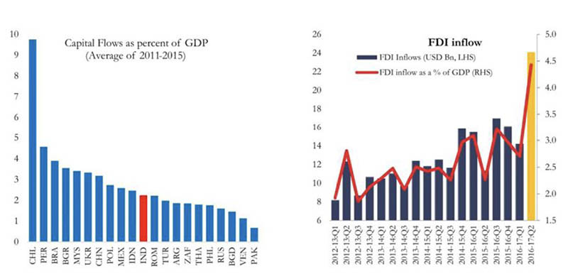
(i) External trade: India’s external trade to GDP ratio has been rising sharply, particularly over the decade to 2012, when it doubled to 53 per cent. As a result, India’s external trade to GDP ratio now surpasses that of China. Charts 2 & 3: Openness to Inflows of Foreign Capital
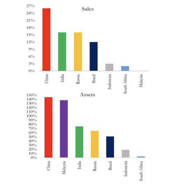
(ii) Foreign investment: India’s net inflows of foreign capital, as a percentage of GDP, are typical of ‘developing’ countries, and not much below China’s (Chart 2). India’s foreign direct investment (FDI) has risen sharply over time (Chart 3). In the most recent year, according to the Government, FDI inflows entered at an annual rate of $75 billion, which is not far short of the amounts that China was receiving at the height of its growth boom in the mid-2000s. Chart 4: Public Sector Units’ Sales and Assets as a Ratio of Gross National Income
(iii) India has carried out substantial privatisation and its remnant public sector, as a share of GDP, is now no larger than that of similar large ‘developing’ countries (Chart 4). (iv) International and domestic corporate lobbies often accuse India of having a bloated government sector. But the Survey finds through a cross-country comparison that India’s government expenditure is no more than would be expected for a country with its level of per capita GDP, i.e., the presence of the Government in the economy has been greatly reduced. In brief, India has tied itself more closely to the world economy and it has left its domestic economy to market forces. The Survey lauds these liberalisation-privatisation-globalisation policies, dating from 1980 on, as having “paid off in terms of growth”: “India has grown at about 4.5 percent per capita for thirty seven years, an impressive achievement.” Goods, capital and labour mobile across regions of India The Survey claims that, not only is India highly integrated with the world economy through external trade and financial flows, but its internal trade – i.e., between Indian states – is quite high by comparison with other countries. The Survey’s estimates for interstate trade flows of manufactured goods amount to at least 54 per cent of GDP. By some measures, it claims, India’s internal trade is even more integrated than that of the US.1 According to the Survey, labour mobility in India is much higher than previously estimated. Migration, it claims, is accelerating. Between 1991 and 2001 the growth rates of the workforce and of the number of migrants for economic reasons were nearly identical, at 2.4 per cent per annum. But as GDP growth started to soar over the next decade, the two began to diverge. During 2001-11, the growth rate of migrants nearly doubled, to 4.5 per cent, while the workforce growth rate actually fell. Thus migrants’ share of the workforce rose substantially. The Survey puts the stock of out-of-district net migrants in India at 80 million.2 As one would expect, migrants leave poorer states and districts, and rich metropolises attract large inward flows of labour. ‘Markets will iron out disparities’
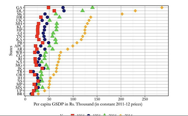
Widening gap between regions Chart 5: Income Levels over the years in India, All Indian States
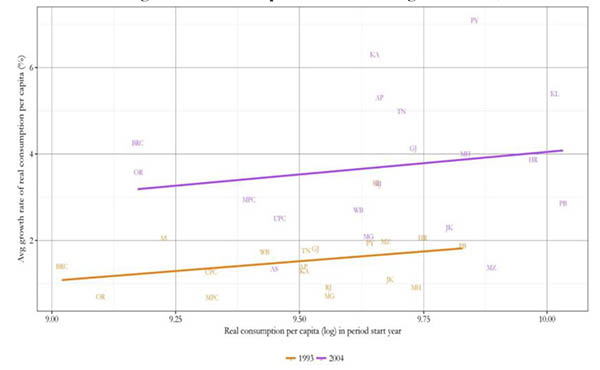
Nor are consumption levels converging across states. The data show that consumption levels have actually been diverging for the last two decades of neoliberal policies. The horizontal axis of the Chart 6 maps the per capita consumption levels in different states in 1993 (orange line) and 2003 (purple line). On the vertical axis is the average growth rate of consumption per capita during the following decades. As can be seen from the upward slope of the lines, the lower the initial consumption level, the lower the rate of consumption growth. That is, the poorer you started, the slower you grew. Chart 6: Divergence in Consumption Levels during 1993-2004, 2003-2012
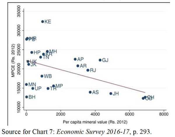
Rich lands, poor people The Survey also explores the “paradox” that regions in India with abundant natural resources have actually tended to be poorer than, and continue to lag behind, regions which are scarce in resources. Chart 7 brings out the fact that, the richer a state is in mineral resources, the lower is its level of per capita consumption, i.e., people in states rich in mineral resources actually have a lower standard of living than people in states which do not possess these resources. As can be seen, with mineral wealth per capita on the horizontal axis, Chhattisgarh, Odisha, and Jharkhand are clustered together to the far right of the Chart. What this means is that the mineral wealth of these states, divided by the number of residents, are the highest among all the states. But at the same time, with consumption per capita on the vertical axis, these three states are at the bottom of the Chart, lower than all the other states. That means that their living standards are the lowest among all the states.3 Chart 7: Monthly Per Capita Expenditure (MPCE) and Per Capita Mineral Value (2012), by State
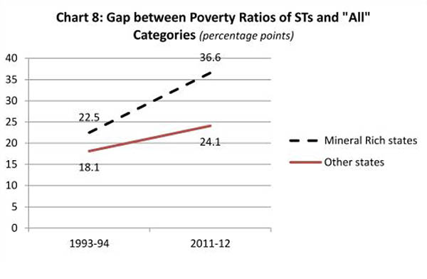
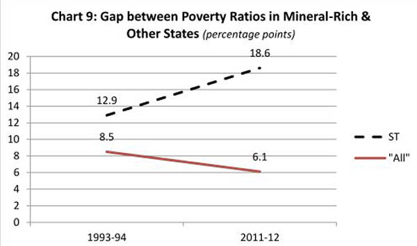
Next, let us look at what ‘growth’ and ‘development’ are bringing these states. For this, we have to look at the trends over a length of time. Charts 8 and 9 below are based on official poverty statistics for mineral-rich states and “other” states.4 First note, in Chart 8, the gap in poverty levels between the categories of Scheduled Tribes (STs) and “All” persons (which includes STs). This gap was very large to begin with in 1993-94 itself, in both mineral-rich and other states. By 2011-12, under neoliberal ‘reform’, the gap widened in both categories of states. However, the gap grew much more sharply in mineral-rich states, where it reached an extraordinary 36.6 percentage points. That is, (i) not only is the inequality between tribals and non-tribals very large, but (ii) it is even greater in mineral-rich states, and (iii) the inequality in mineral-rich states is growing even faster than the corresponding inequality in other states.
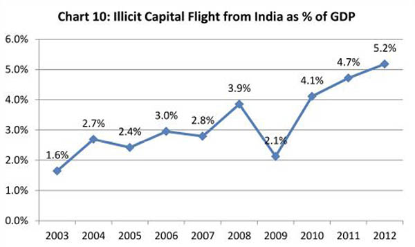
Source for Charts 8 & 9: Calculated from Economic Survey 2016-17, p. 293. As a result, we get a strange illusion. When we look at the total population of states, the gap between mineral-rich and other states seems to be narrowing; but this is merely because of the growing inequality within the mineral-rich states. As we can see from Chart 9: (i) To start with, in 1993, the people of mineral-rich states were poorer, on the average, than the people of mineral-poor states. (ii) The gap between mineral-rich and other states narrowed over the period of neoliberalism (see the solid line in Chart 9). From this it appears there was growing ‘convergence’ between the populations of mineral-rich and mineral-poor states. (iii) However, for the tribals of mineral-rich states, the contrary was true, as can be seen from the dotted line in Chart 9. In sum, the process of developing mineral resources may enrich some sections in mineral-rich states, but shrinks the tribals’ share in those states even further. In all states the process of so-called ‘development’ actually widens the existing divergence between communities and classes; but the process of exploiting natural resources widens the divergence even further. Counterpart of poverty: soaring wealth The significant point to note is: The counterpart of the dispossession of the tribals is the growing wealth of those at the top, who benefit from precisely these processes of dispossession. As is now widely known, between 2000 and 2016, the share of the country’s wealth owned by the top 1 per cent grew from 36.8 per cent to 58.4 per cent.5 There has been a rapid increase in the number of billionaires in India, as also in the assets and power of the corporate sector in the Indian economy. One study found that of India’s 46 billionaires in 2012, 20 had drawn their primary source of wealth (at least originally) from sectors in which monopolistic economic power and the help of State agencies played a crucial role – e.g., real estate, construction, infrastructure, and mining.6 The Economic Survey 2015-16, also authored by the same Chief Economic Adviser, used income tax data to update an earlier study on the share of the top 1 per cent, the top 0.5 per cent, and the top 0.1 per cent of the Indian population in national income. The earlier study had found that there was a rise in the income share of these minuscule minorities since the 1980s, when liberalisation and faster growth started. The update in the Survey shows that inequality soared in the 2000s, to levels comparable to those under British colonial rule.7 It should be noted that these estimates are conservative. Since they are based on income tax returns, they ignore tax evasion, which has most likely increased over time. A leading study by theWashington-based Global Financial Integrity (GFI) estimates that illicit capital flight from India reached 5.2 per cent of GDP by 2012 (see Chart 10).
Estimates of capital flight from Dev Kar and Joseph Spanjers, Illicit Financial Flows from Developing Countries, 2003-2012, Global Financial Integrity, 2014. GDP figures from IMF, World Economic Outlook Database, October 2016. A GFI report on India says: “liberalization of trade and general deregulation led to an increase in illicit flows rather than their curtailment…. It seems that trade liberalization merely provided more opportunities to related and unrelated companies to misinvoice trade.” More importantly, as inequality grows, so do illicit financial outflows: “more rapid economic growth in the post-reform period has actually led to deterioration in income distribution… A more skewed distribution of income implies that there are many more high net-worth individuals (HNWIs) in India now than ever before. Based on the capacity to transfer substantial capital, it is the HNWIs and private companies that are the primary drivers of illicit flows from the private sector in India (rather than the common man). This is a possible explanation behind our findings that the faster rates of growth in the post-reform period have not been inclusive in that the income distribution is more skewed today, which in turn has driven illicit flows from the country."8 (It is important to note here that this form of ‘black money’ was virtually untouched by the demonetisation exercise, and indeed would be untouched by digitisation too.) In other words, it is the very process of greater integration of the Indian economy with the world economy, and the increase of domestic inequality, both outcomes of neoliberal policy over the past quarter-century, that have increased capital flight from India. Correspondingly, the checking of illicit flows would require measures counter to the entire thrust of neoliberal economic policy. Most of the above material is drawn from the horse’s mouth, as it were, i.e., the Economic Survey itself. Remarkably, however, the Survey’s authors refuse to draw the conclusion that the divergence in incomes and consumption is the outcome of the growth process itself, the very process of liberalisation, privatisation and globalisation which it celebrates. Rather, the Survey recommends more of the same (for example, while acknowledging that the scope for expanding exports is narrowing, it calls for further trade liberalisation and a thrust on expanding exports). This is the sorry outcome of the neoliberal ideological blinkers of the authors of the Survey.
Notes: 1. The dampening effect of distance on trade seems lower in India than in the US, which is surprising given the difference in levels of development and infrastructure. The Survey does not comment on the fact that this high level of internal trade is taking place in India even without the much-touted Goods and Services Tax, which the rulers claim will magically unify the Indian economy. (back) 2. It also analyses Railways data of unreserved passenger travel, as a proxy for work-related migrant flow, and finds that annual migration since 2011 might be 9 million a year, i.e., even higher than Census data would indicate. (back) 3. The same pattern can be seen with regard to their per capita income. (back) 4. Although the official methodology places an absurdly low cut-off line for for computing poverty, we can still observe a few things from the data. The Economic Survey has taken the poverty line in these calculations from the erstwhile Planning Commission and Tendulkar Committee report, which set a controversially low cut-off for poverty. (back) 5. Credit Suisse, World Wealth Report 2016. (back) 6. Aditi Gandhi, Michael Walton, “Where Do India’s Billionaires Get Their Wealth?”, Economic & Political Weekly, 6/10/2012. (back) 7. See Banerjee, A., & T. Piketty, 2005, "Top Indian Incomes, 1922-2000", World Bank Economic Review, and Economic Survey 2015-16, p. 115. (back) 8. Dev Kar, The Drivers and Dynamics of Illicit Financial Flows from India: 1948-2008, Global Financial Integrity, November 2010. (back)
NEXT: How One Class Enriches Itself at the Expense of Another
|
|
| Home| About Us | Current Issue | Back Issues | Contact Us | |
|
|
All material © copyright 2017 by Research Unit for Political Economy |
|